BEHIND THE BRAND
The Farleigh House brand was born in 2023 and masterminded by the wonderful duo from We Are The Loves, a strategic branding agency based in Bath. Aligning to our ethos of working and supporting local businesses, we instantly connected with Emma and Jules, and chose to entrust them to bring to life our vision.
We sat down with Emma from We Are The Loves to tell you the story behind our brand - from the start of the process right through to the creation of our logogram, colour scheme and typography.
Where do you start when you receive a brief like the Farleigh House one?
When receiving a brief like Farleigh House, the starting point is always immersing myself in the story of the place. For Farleigh House, it meant understanding not just the history of the building but also the vision Bath Rugby had for transforming it into a venue for weddings and events. We spent time exploring the estate, talking to the team, and getting a sense of the culture and values that they wanted to communicate. It was about capturing the essence of the place and aligning it with the new purpose they had in mind.
What are the first few steps to a brand development process, especially when starting from scratch as you did with FH?
The first few steps involve a lot of discovery and research. We started by working directly with the CEO and marketing team to refine what Farleigh House stood for, alongside its connection with Bath Rugby. This involved workshops, stakeholder interviews, and an in-depth competitor analysis. From there, we distilled the insights into a clear brand positioning that differentiated Farleigh House from its competitors. With a defined brand personality, we moved forward to create visual elements that would communicate that positioning effectively.
Once you’ve established a brand’s personality, where do you go from there?
Once the brand's personality is established, we begin translating that personality into tangible elements. This includes designing visual assets like logos, colour palettes, and typography. The goal is to ensure that every piece of the brand tells the same story and evokes the right feelings in the audience. We also create brand guidelines to maintain consistency across all touchpoints.
How did you start the creation of the brand’s logogram first draft ideas?
The creation of the Farleigh House logogram started with an exploration of the estate's architecture. We wanted to pay homage to the building itself, so we studied the proportions, shapes, and distinctive features of the house. The first drafts were informed by sketches of these architectural details, aiming to capture the grandeur and elegance of Farleigh House in a subtle, modern way. We wanted the logo to feel connected to the estate without being overly literal.
What is the meaning behind the Farleigh House logogram?
The Farleigh House logogram is a reflection of the building’s key architectural features. The design is informed by the proportions and shapes of the major parts of the building, which creates a subtle nod to its grandeur. It’s a way of acknowledging the estate’s rich history while recasting it in a contemporary format that resonates with a vibrant yet down-to-earth audience.
What are the key elements you emphasise to a client to ensure the brand sings from the same hymn sheet?
Consistency is key to a successful brand. We emphasise the importance of having clear brand guidelines that cover every aspect—from typography to photography. We also stress the importance of training the team on these guidelines, ensuring everyone understands how to use the brand assets correctly. Every touchpoint, from the website to social media posts, should reflect the same core values and aesthetics. This unified approach helps build a strong, recognisable brand presence.
Why did you choose the Farleigh House colours?
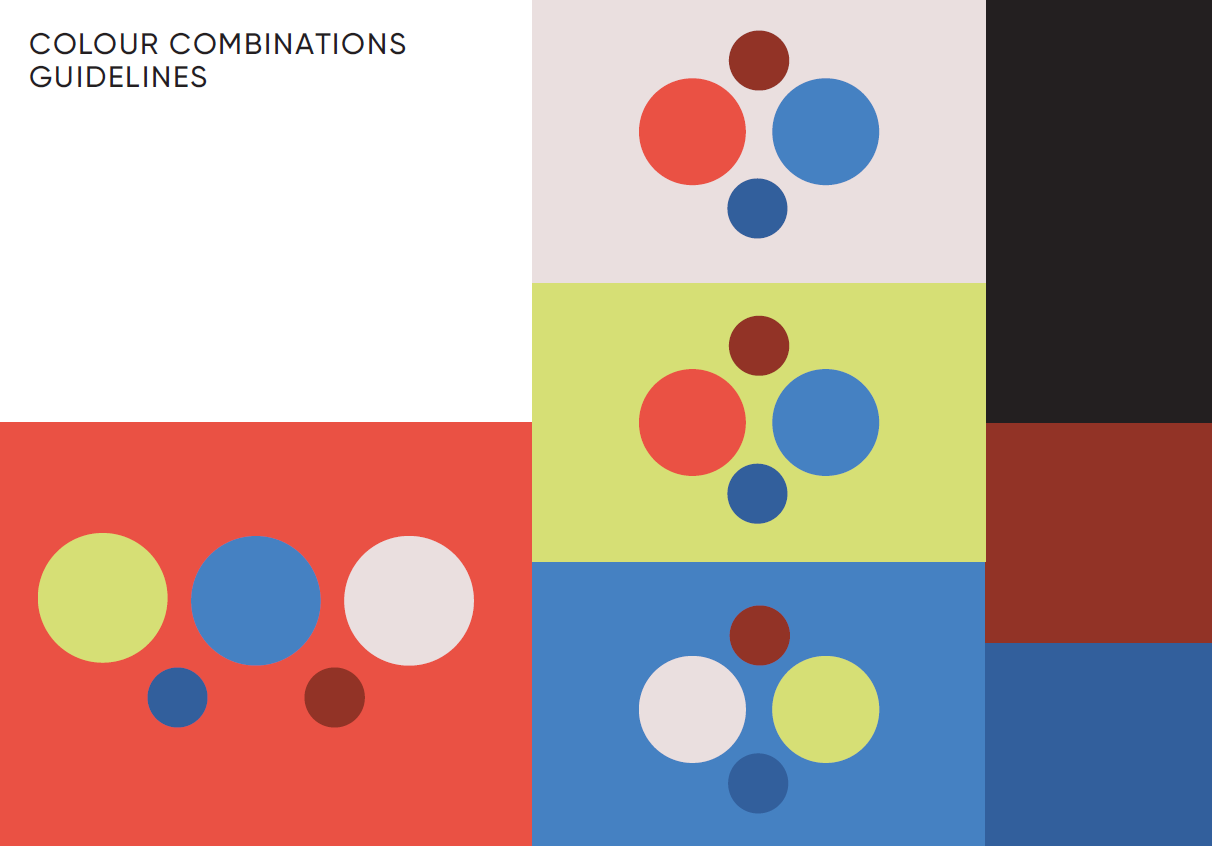
The colour palette for Farleigh House was chosen to reflect both the historic and modern aspects of the brand. We opted for classic, muted tones that evoke the timeless elegance of the estate, paired with more contemporary shades that add vibrancy and appeal to a modern audience. The colours needed to feel luxurious yet approachable, aligning with the brand’s personality of refined hospitality.
Once finalised, how do you ensure the brand’s personality is reflected through all touch points?
Ensuring the brand’s personality is reflected through all touch points requires a combination of detailed guidelines and close collaboration with everyone involved in the brand's execution. For Farleigh House, we worked closely with their photographer to develop a shot list that aligned with the brand identity, and we collaborated with the web development team to ensure the website carried through the visual and tonal elements we had established. Regular check-ins and quality assurance are crucial to maintaining the brand’s integrity.
And finally, what do you love most about this process?
What I love most about this process is seeing a vision come to life. There’s something incredibly rewarding about taking an idea from concept to completion, especially when it involves breathing new life into a historic place like Farleigh House. Watching the brand take shape and seeing how it resonates with audiences is truly fulfilling. It’s the blend of creativity, strategy, and collaboration that makes it so exciting.


